Establish their main goal or purpose for the website.
The very first thing you need to do when designing any website is to learn the main focus or purpose of the website. Why does your client need a website, what are they trying to accomplish? If you haven’t already go check out my post on Good Designers Ask More Questions, it will help you gain a base of questions to kick-off with your clients. The reason why knowing the main goal is so important is because it will better inform all design decisions you make for the site.
Let me describe what I mean, let’s say our client is in the pet industry and they come to you asking for a website redesign. Well, what it is that they do specifically in the pet industry? The client tells us, “We specialize in supplements for dogs, cats, and humans.” Why do you also sell human supplements, I thought you said pet industry? The client elaborates, “Well we do sell human supplements too but that is because our pet supplements are so natural and work so well that people asked us if they could also take it themselves, that is when we started marketing human supplements. It’s the same product really, there is just a difference in dosage.” What are you looking to do on your website, sell these supplements? The client says, “Yes, we would like to sell more of our supplements online and also lead people to stores that carry our product.”
If you couldn’t tell this was an actual client that I have worked with in the past but they are a great example to prove my point. Don’t assume anything, let your client speak and describe what it is they do, what they want (main goal), and why it matters to people. In the short conversation above we learned what it is they did, they specialize in supplements for dogs, cats, and humans supplements. We learned their unique selling proposition or USP, their supplements are so natural and work so well that people wanted to see if it would have the same effect on them. Lastly, we learned what they want to do on their website which is to sell more of their products online.
Many more questions should come to mind after an initial conversation with your client like the example above. Be sure to ask more throughout your whole process to make sure you are headed in the right direction with them.
Design their main CTA and maximize its effectiveness.
After you learn what the goals of the site are you can start designing the main CTA or call-to-action. The main call to action should relatively be the loudest thing on the page. Not in a bad way, obviously, I mean in a tasteful, designer way. Make this interaction a clear beacon of light on a path for users to go down. This “path” is the conversion funnel, the conversion funnel’s main purpose is to lead users to the main page they should convert on. For our pet industry example above, their main conversion page was the product detail and cart pages.
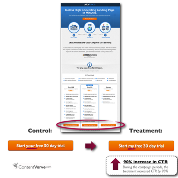
Use first person point of view when labeling CTAs because it takes the conversation from impersonal to personal, people like personal connections better. Below is first person point of view conversion example from unbounce.com, the difference they saw in the exact same button using a third vs. first person point of view was a 90% increase in conversion rate.
With that being said, again, don’t assume anything. If there is one thing I have learned from testing how things perform it’s not to assume I know anything, everything performs differently depending on its unique situation and audience. Try changing you CTAs using a first person language and see what happens to your conversion rates.
Tie all inner pages back into serving the main goal.
When you’re designing an inner page like the about page for a company, that doesn’t mean you stop leading users through the conversion funnel. No, it is not the main purpose of that page but that doesn’t matter, the overall goal still needs to be present. A good way to implement your conversion funnel is by possibly featuring a product in the sidebar or giving your users a way to contact your client for services simply on that page. Of course, you don’t want to just randomly place theses elements on a page you want to help support them with content that relates to the page they are on.
Now, sometimes there are exceptions to the rule, for example, a blog. When users go to a blog they don’t have the mindset of buying your client’s products or services they are coming to be informed about something or read the latest article because they enjoy the content. In situations like this, I highly suggest not to muck up that experience by pushing for them to buy products or services. The goal of a blog is to give valuable information and to build up a lot of content establishing your client’s brand as an authority in their field. When users are ready to buy, guess what, they will already be thinking of your client’s brand because they have been consuming their content and think, the content they put out is very valuable about this type of focus in this area I am interested it, I bet, they have great products and services as well. If you can get your client’s target audience to think like that you have won!
Simplify everything especially the conversion funnel.
Let me tell you what I mean when I say simplify, the experience in which a user can actually contact, schedule and appointment, or add a product to their cart should be accessible to them from the homepage. On click, that is all it should take for them to start the process of subscribing, scheduling, contacting, or buying. The actual design of a website needs to be simple as well, give your content room to breath, too much and your site seems to go on forever, too little and you run the risk of your site design feeling spammy. Be conscious of your users time and how much the have to strain their eyes to read content on the page.
One thing I want to get straight, simple design doesn’t mean little content. You must have content, in fact, design is nothing without it and vice versa. Think of it this way, you are taking a road trip and on this road trip you are traveling to Colorado up into the mountains. On this trip, you have four friends that will be traveling with you; think of content as you and your friends. To get up into the mountains you need a vehicle to get you all there safely; the vehicle is the design. You wouldn’t take a smart car up into the mountains with you and your four friends, it just doesn’t work. Choose to design to fit the content, copyrighters will argue with you every time on who should go first, they should, it’s our job to design around content otherwise it’s just words on a web page. Always design with content in mind, it just doesn’t work the other way around.
Two similar companies will not convert the same.
Did I mention don’t assume anything, yes I did, DON’T ASSUME ANYTHING! Just because you working with a company that is in the same industry as the last client doesn’t make you an expert on how to design for their industry. Each company has their own special quirks and their own target audience to appeal even if it is the same exact industry with a similar product or service. It is your responsibility as a designer to dig deeper what is it that makes your client different than the rest. Bring that out and make it known to the world and always answer the questions I stated in the first section of this blog as soon as possible. The questions to answer are what is it, how does it work, what is the ask (client’s main goal), and why does it matter to people? Within those questions should be a really cool unique selling point or USP that you can bring to the user’s attention and if there isn’t ask yourself if you should even do work for this client.
My hope for this post was to give you some insight to building better user interfaces, again, remember to ask questions it will only help you gain more understanding to use for your clients.
[divider line_type=”Full Width Line” custom_height=”20″]
[recent_posts title_labels=”true” category=”all”]