Whisper On-Arrival
Application
Detecting Bovine Respiratory Disease through a smart paddle stethoscope and the Whisper On-Arrival application.
To comply with my non-disclosure agreement, I have omitted and obfuscated confidential information. All information below is my own and does not necessarily reflect the views of Merck Animal Health.
My Role
UX/UI Designer
The Team
1 UI Designer (Me)
1 Software Engineer
Key Contributions
Wireframes
User Flow
UI Design
UX Design
05.01.18 – 11.01.2020
The Context
Merck & Co. designed a stethoscope that detected the severity of Bovine Respiratory Disease (BRD). They needed someone to design an application that visualized the severity to the customers who wanted to use this stethoscope. So, they came to me within Quantified Ag to help them design a simple app.
The Problem
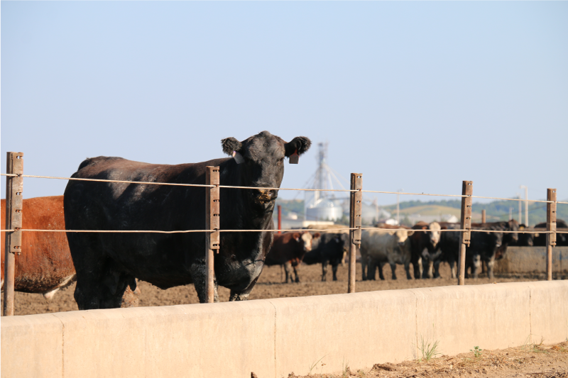
Bovine Respiratory Disease or (BRD) is one of the main reasons cattle die in feedyard operations around the world. Without taking preventative measures the disease continues to spread like wildfire.
Why
Prevention of this disease requires early detection and treatment. Treat the animal too late and the animal just declines in health as it normally would without treatment. Whisper® On Arrival developed by Merck Animal Health is a veterinary stethoscope that listens to the breathing patterns and rates the severity of BRD present in the animal upon their arrival at the feedyard.
My Role
I was tasked to understand the relationship users had with this device and design an application around that relationship.

The Challenge
My challenge with this application was to design around the challenges of the hardware. The product went from being a stethoscope to a paddle in the middle of my design process. Another challenge was that users hated using the initial product because of the time it would take to go through content entry.
Design Challenges
- This application had several iterations due to the product design changing.
- This application needed to be designed for exclusive use on a tablet.
- We learned users wanted to barely interact with this applications interface.
- Content entry needed to be automated without being connected to Precision Livestock’s CMS.
- Content entry needed to be on a timer to promote a hands off experience.
Concept #1
Initial Concept
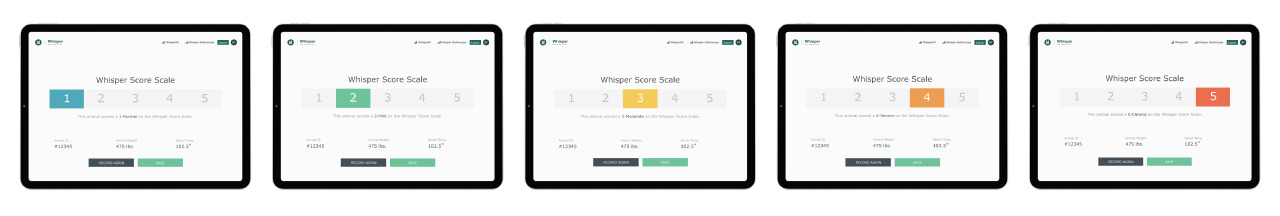
Initially the Whisper system worked on a 1 to 5 scale of severity. The idea was to keep the design so simple that users could see if treatment needed to take place or not. Also, at the time user error regarding the stethoscope was high so we designed a screen letting them know they needed to try recording again.
Problems That arose
We learned that this initial concept was still taking too long during processing. Also, many customers didn’t have time to train Pen Riders what the differences of severity were on the 1 to 5 scale. The last problem we ran into was time. Quantified Ag was being groomed to be acquired by Merck at the time but we still had our other app Precision Livestock to launch. It was at this time Merck killed this project and brought it to a third-party agency for further execution.

After Acquisition
After Merck acquired Quantified Ag this project was brought back onto our desks. They took the project to a third party agency but the application had issues to work through and a strong lack of knowledge in the industry so the project was once again assigned back to me for UI/UX execution.
Product Vision
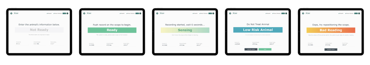
Once the project came back we had learned a couple of things. The product itself no longer was the same. It changed from a stethoscope to a paddle to help transition the product from being used in a slower-paced “Doctoring” event to a faster-paced “Processing” event.
Recurring Problems
We gained feedback from user interviews stating they still wanted it to be faster and they didn’t want to be stuck in content entry they needed it to be automated.
Solutions
So, we began reworking and wireframing new solutions based on the most current design we got back from the third-party design firm and came up with these design solutions.
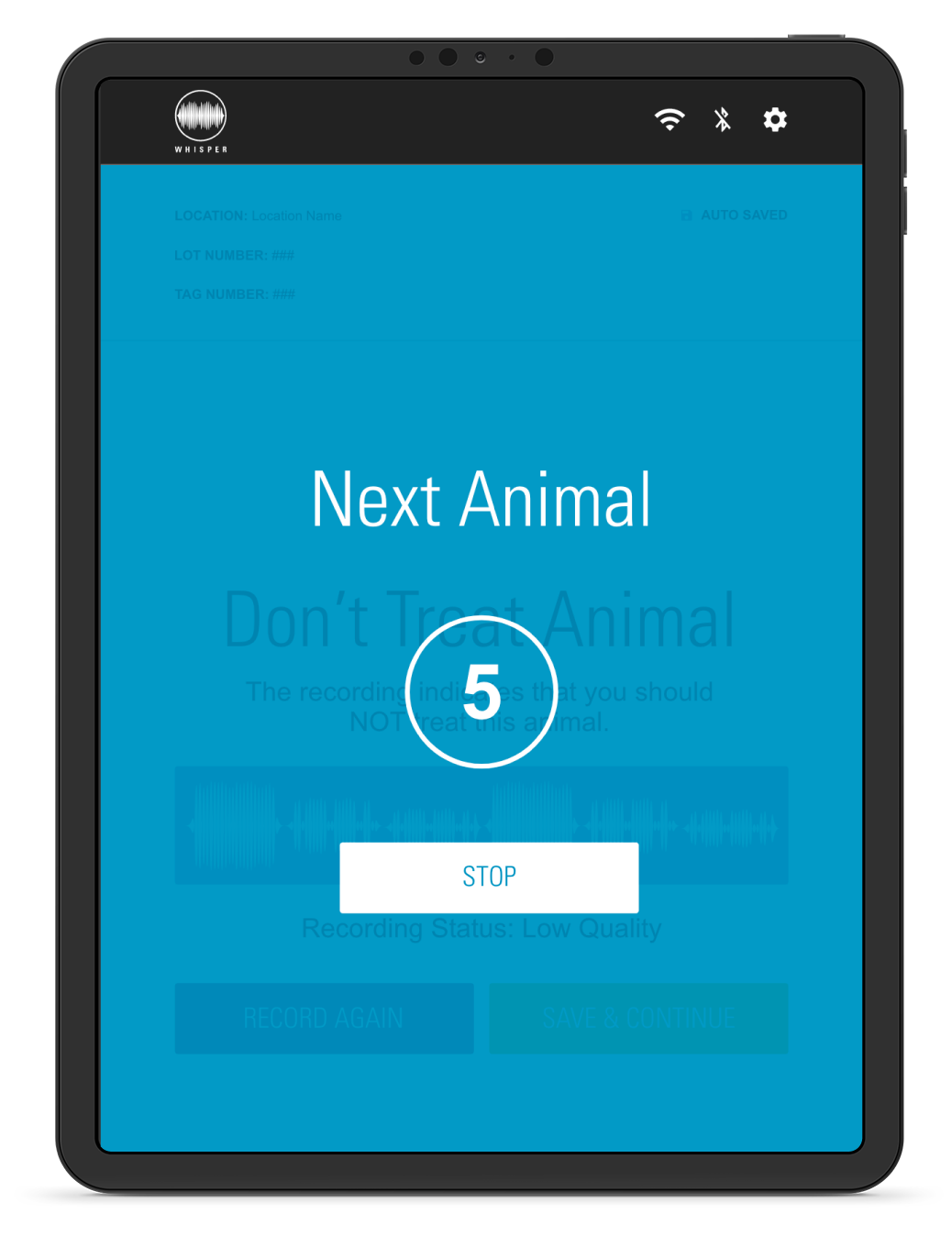
- Do away with the 1 to 5 scale and tell the user to treat or don’t treat the animal.
- Once the outcome is displayed show a countdown to go to the next animal and/or recording screen.
- If some content entry necessary let the user fill out a lot order first.
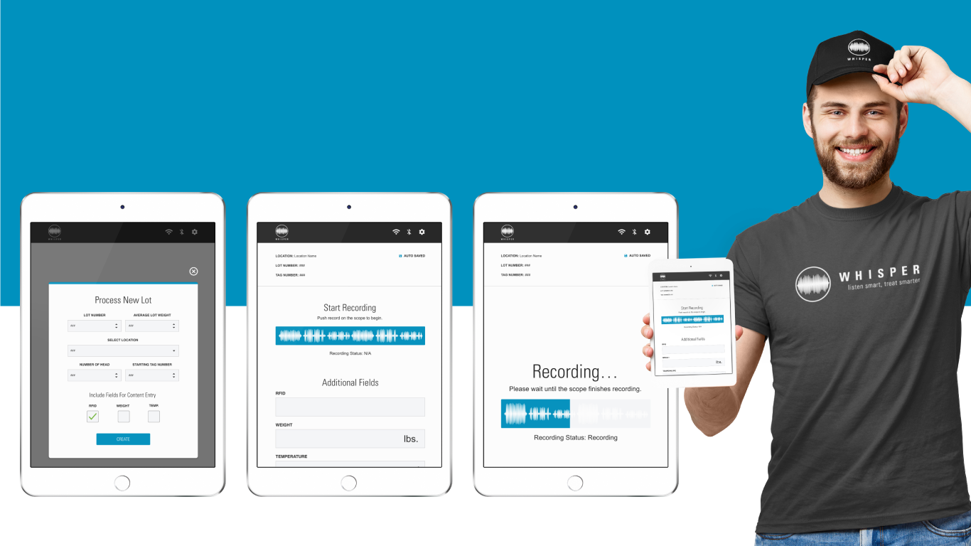
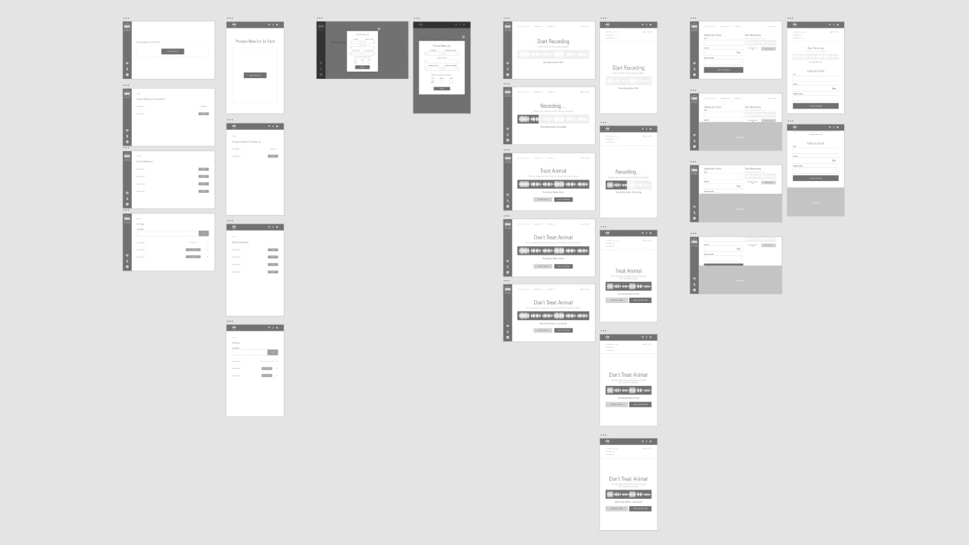
Wireframes
Once I understood who I was designing for and what the stakeholders had in mind for the product vision, I started tackling this project’s wireframes. In this process, I established the design foundation for the entire application.
- Application Settings
- Lot Creation
- Recording With Stethoscope Only
- Recording With Stethoscope + Basic Content Entry
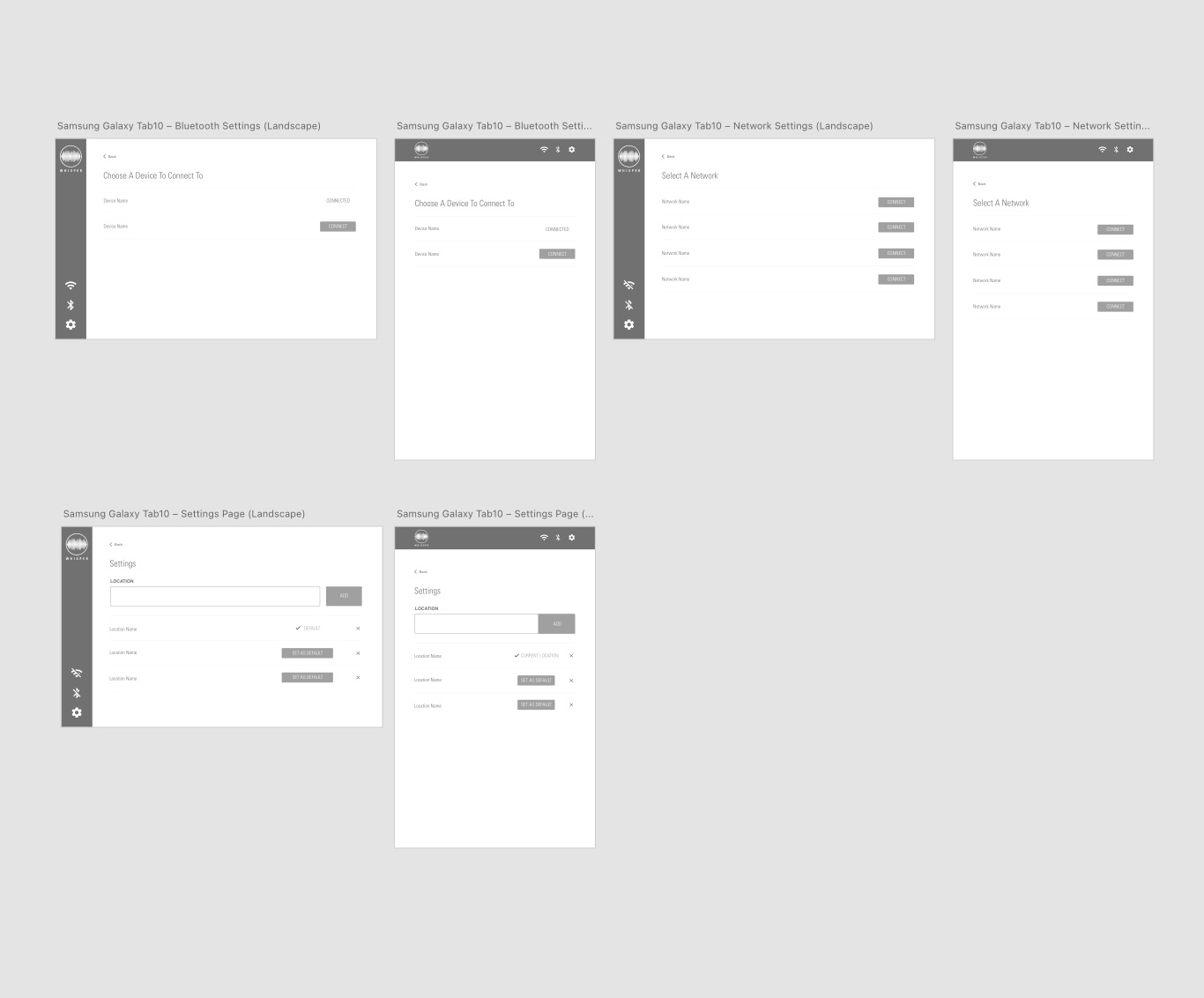
Applications Settings
While the settings portion of this application was very simple/minimal it was designed to help user with very little technology exposure to make sure the applications settings were correct.
- Network Settings
- Bluetooth Devices
- Location Settings


Lot Order Creation
Again very minimal this design gives users a place to land and one simple action to take before they begin processing. The simplicity is intentional as these users don’t like interacting with technology because they thing it complications current processes. In this section of the application I execute:
- Initial Landing Screen
- Lot Order Creation


Recording Screens
On these screens there are two options. Users who are recording content and users who are not. We kept the design minimal and the interactions down to a minimum. The intention here was to be hands off, quick, and underwhelming.
- Recording Screens Without Content Entry
- Recording Screens With Content Entry
- Keyboard UI
Without Content Entry


With Content Entry


Insight #1
Users need the application to be hands-off as much as possible. It’s a luxury to have enough hands for data entry let alone handling the animals during processing.
Insight #2
User desire for the application to be quick. It already takes more time during processing to use the paddle to listen for BRD. Time is money so simplicity and quickness is gold.
Insight #3
Not every processing event is the same sometimes there will be more content entry needed. Users wanted the option to add more information if necessary.
What I Learned
Unfortunately, we don’t have any results yet to see how this iteration of the application is working with early adopters but we are hopeful the round of updates should serve our users better.
This project was a pain in the, you know what. I learned that I prefer to stick with a project till the very end and have a full understanding of the product vision first before heading into an application design. Changing as much as this project did we had to start pretty much from scratch. However, we did have a huge lesson in knowing your product really well before heading into an application project.
To Be Continued…